Explore the allure of heritage colors, vintage hues, and traditional shades in the timeless old money color palette.
Disclosure: This post contains affiliate links. We may earn a commission at no extra cost to you.
What makes the old money color palette so timeless?
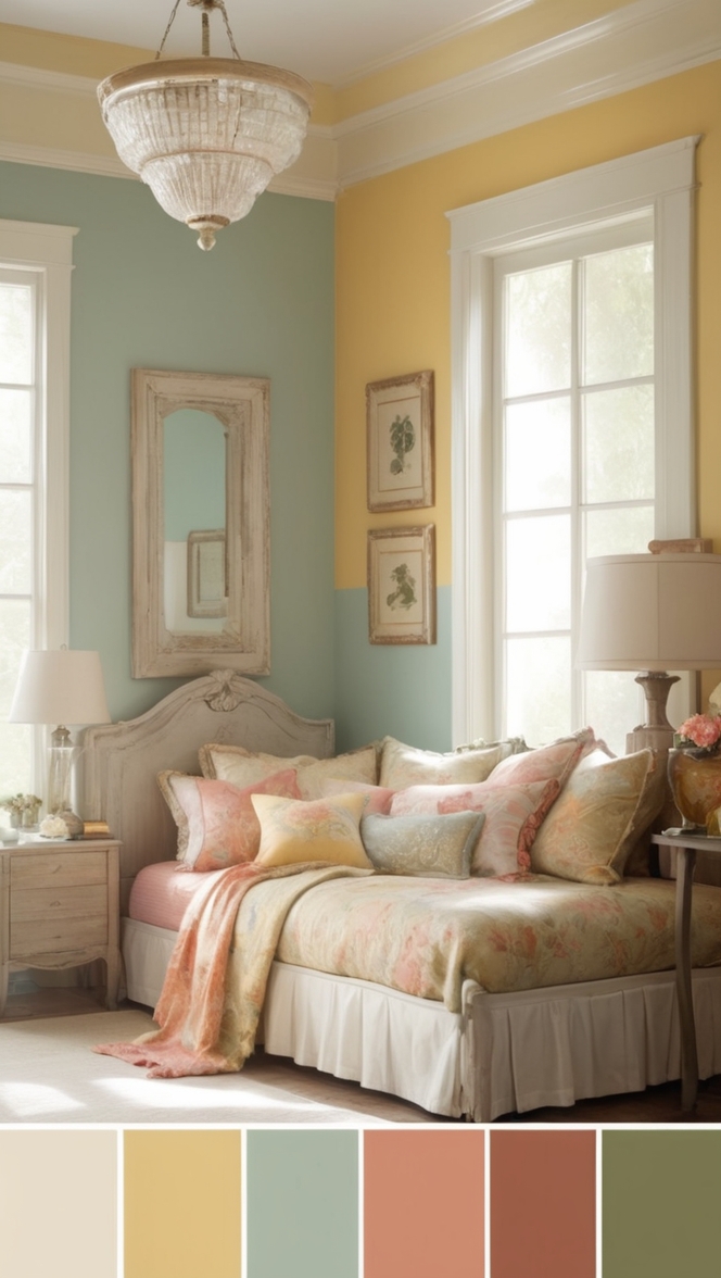
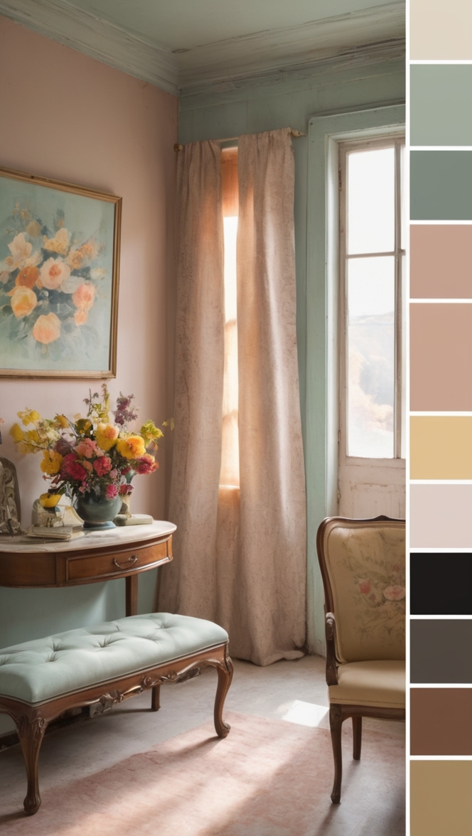
Old money color palette combines classic and rich hues like deep greens, luxurious burgundies, warm neutrals, and elegant golds. These colors evoke a sense of sophistication and tradition, making them a timeless choice for home decor. When incorporating this palette into your home, consider mixing different textures and patterns to add depth. To avoid overwhelming the space, balance these rich colors with lighter shades or whites. Proper lighting and furniture placement can enhance the luxurious feel of the old money color palette.
What Makes the Old Money Color Palette So Timeless?
As a homeowner who appreciates the classic elegance and sophistication of old money style, I have often pondered the enduring appeal of the color palette associated with wealth and refinement. The colors that evoke a sense of heritage, tradition, and luxury have stood the test of time, transcending fleeting trends in the world of fashion and design. Let’s delve into the reasons behind the timelessness of the old money color palette and its psychological impact on perception.
1. Why do certain colors evoke a sense of sophistication and wealth?
The colors commonly associated with old money – such as deep burgundy, forest green, navy blue, and rich gold – exude a sense of opulence and refinement. These hues are often found in traditional, high-end interiors and evoke a feeling of luxury and exclusivity. The depth and richness of these colors give off a sense of history and heritage, creating a timeless and elegant aesthetic.
2. How have the colors associated with old money stood the test of time?
Unlike trendy color schemes that come and go with the seasons, the old money color palette has remained constant throughout the years. These colors have a classic appeal that transcends passing fads, making them a timeless choice for those who appreciate sophistication and elegance in their surroundings.
3. What psychological effects do these colors have on perception?
The colors associated with old money have a powerful psychological impact on perception. Deep, rich hues like burgundy and navy blue are often perceived as luxurious and upscale, creating a sense of prestige and sophistication. These colors can influence how we perceive a space, making it feel more elegant and refined.
4. Are there historical reasons behind the association of certain colors with wealth?
The association of certain colors with wealth and luxury has deep historical roots. In the past, certain pigments were rare and expensive to produce, making them exclusive to the elite class. Colors like deep reds and blues were associated with royalty and nobility, further solidifying their connection to wealth and status.
5. How do these colors differ from trends that come and go in the fashion industry?
While fashion trends may change rapidly, the old money color palette remains a constant in the world of interior design. These colors have a timeless quality that transcends temporary fads, making them a reliable choice for those seeking a sophisticated and elegant aesthetic in their homes.
6. Can anyone adopt the old money color palette or is it reserved for a certain class?
The beauty of the old money color palette is that it is accessible to anyone who appreciates classic elegance and refinement. While these colors may have historical associations with wealth, they can be incorporated into any home to create a sense of timeless sophistication. It’s not about wealth or status but about a shared appreciation for beauty and tradition.
7. What role does culture play in the perception of the old money color palette?
Culture plays a significant role in how we perceive the old money color palette. In some cultures, certain colors may have different associations or meanings, influencing how they are perceived in a design context. However, the universal appeal of the old money color palette lies in its timeless elegance and sophistication, transcending cultural boundaries.
As a homeowner who has embraced the old money color palette in my own space, I can attest to the enduring appeal and timeless beauty of these hues. Whether it’s a deep burgundy accent wall, a rich navy blue sofa, or touches of gold throughout the decor, these colors bring a sense of luxury and refinement to any interior. The old money color palette is not just a trend but a classic choice that will never go out of style.
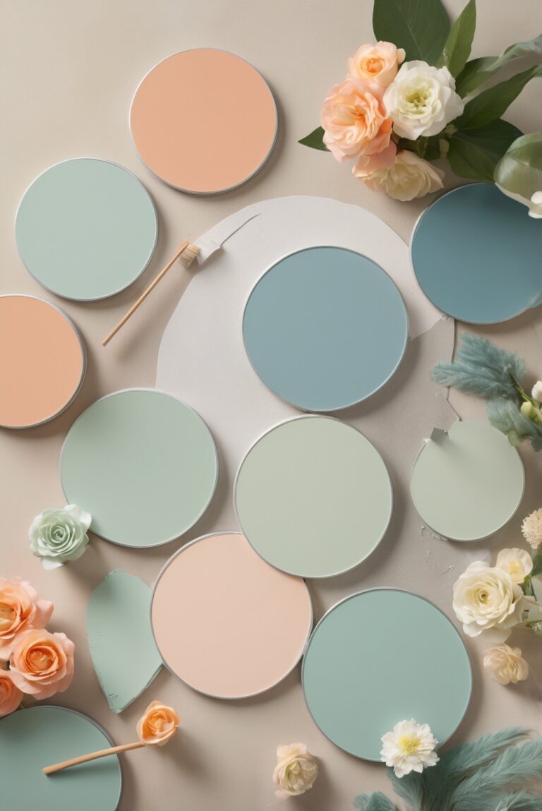
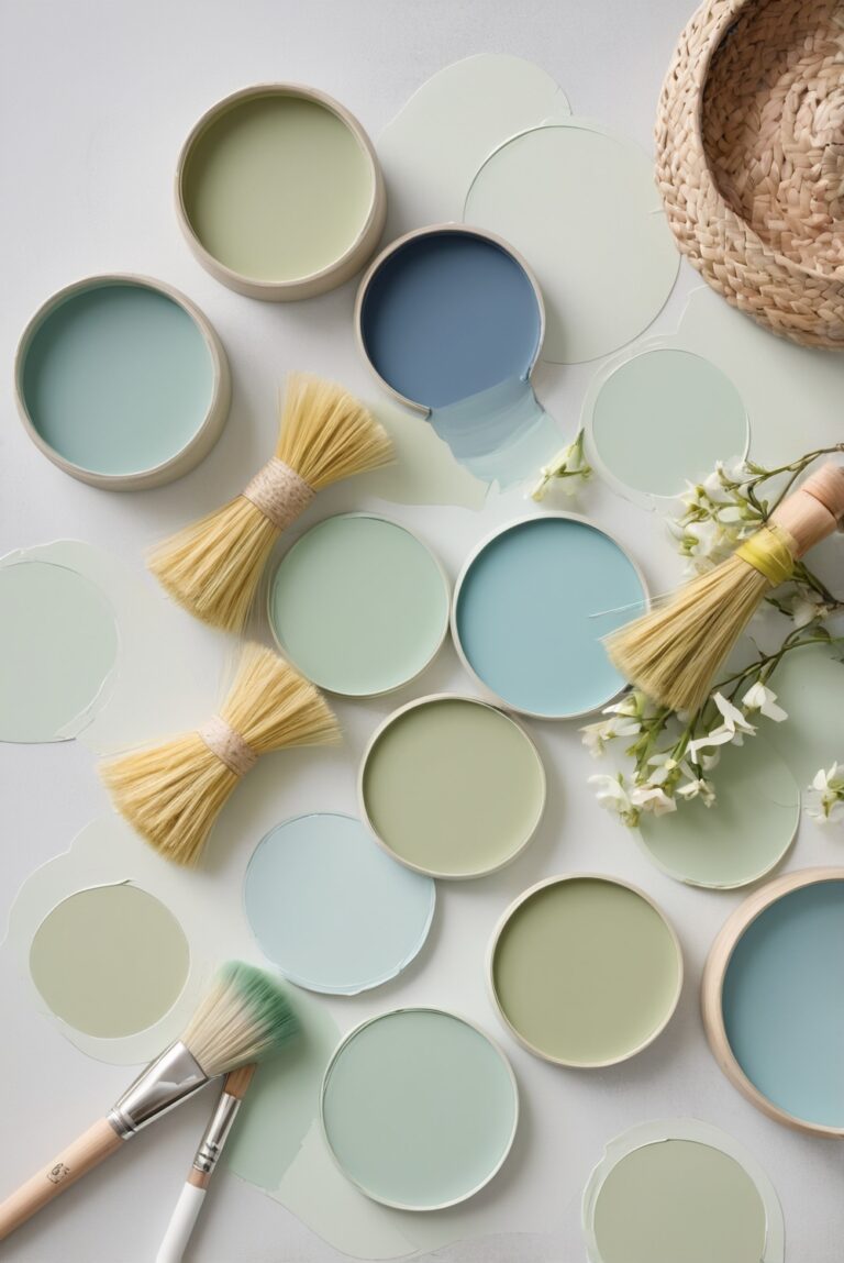
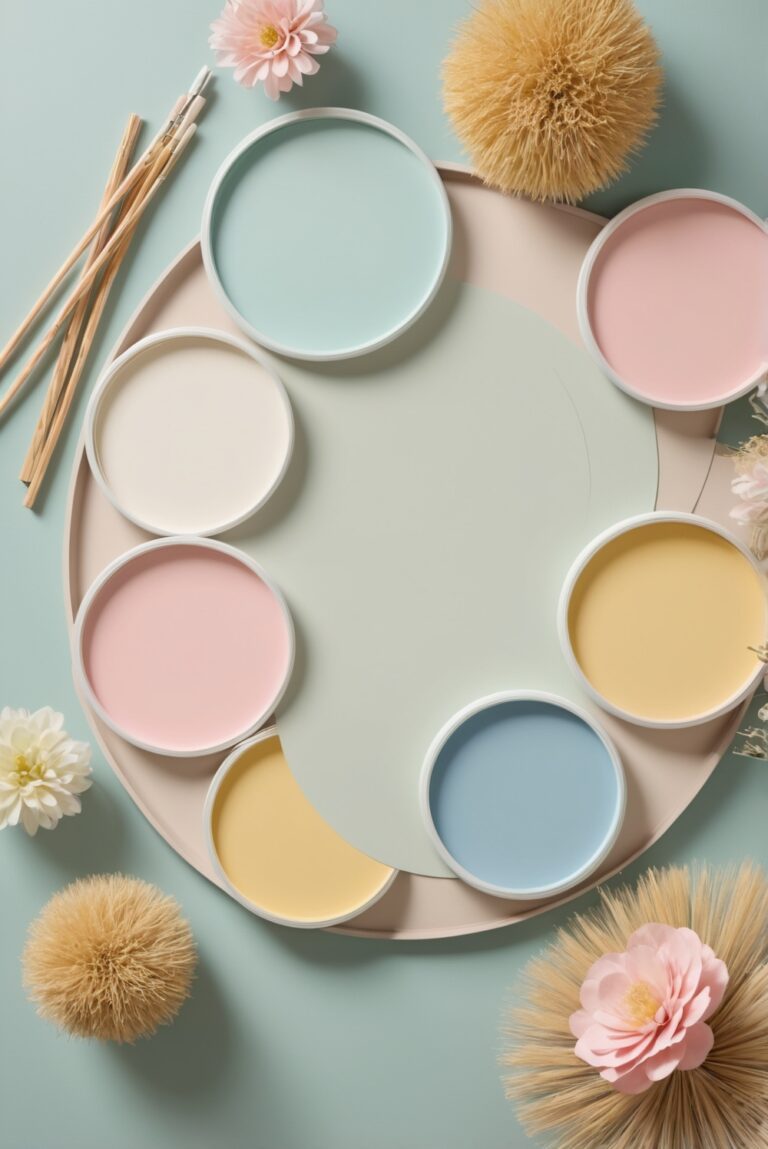
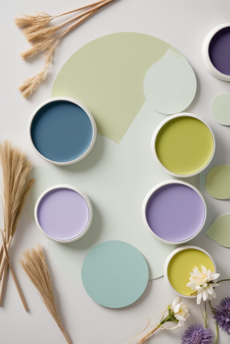
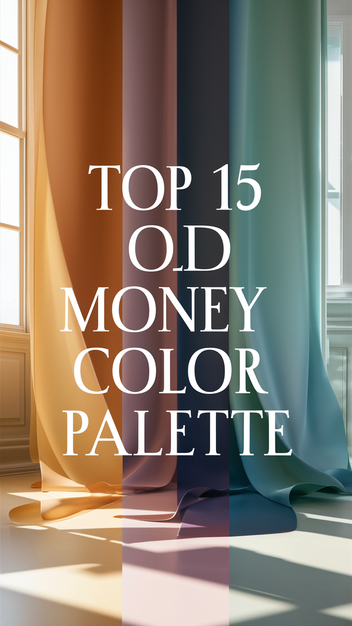
Unlocking the Elegance: 12 Timeless Old Money Color Palette Ideas
The old money color palette exudes sophistication and tradition with its classic hues that stand the test of time. Dive into the world of timeless elegance with these 12 rich and luxurious paint colors inspired by the old money aesthetic:
1. Velvet Green (Sherwin-Williams)
Embrace the opulence of deep greens with a touch of velvet texture for a regal look in your living room or study.
2. Burgundy Bliss (Benjamin Moore)
Add a luxurious touch to your dining room or bedroom with a rich burgundy hue that exudes warmth and sophistication.
3. Golden Elegance (Behr)
Infuse your space with a touch of glamour using elegant gold accents that complement the old money color palette.
4. Royal Navy (Farrow & Ball)
Create a sense of depth and richness in your study or library with a deep navy hue that exudes timeless elegance.
5. Antique Ivory (Valspar)
Add a touch of vintage charm to your space with a warm neutral hue like antique ivory that pairs beautifully with rich colors.
6. Victorian Rose (Sherwin-Williams)
Bring a touch of romance and sophistication to your bedroom or sitting area with a delicate rose hue inspired by Victorian elegance.
7. Classic Charcoal (Benjamin Moore)
Create a sense of drama and sophistication in your study or home office with a timeless charcoal hue that adds depth to the space.
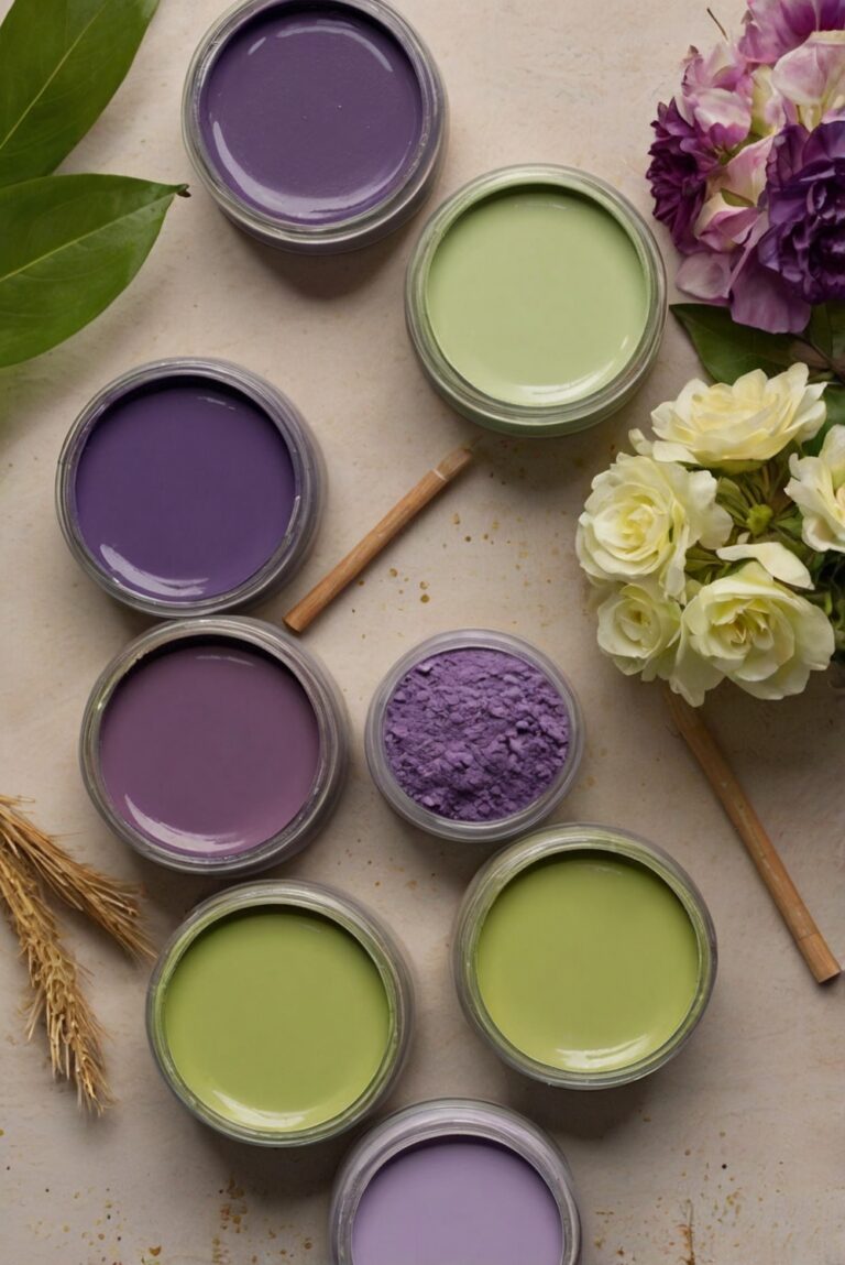
8. Regal Purple (Behr)
Elevate your space with a regal purple hue that exudes luxury and sophistication, perfect for a statement wall or accent piece.
9. Champagne Gold (Farrow & Ball)
Add a touch of glamour and elegance to your space with a champagne gold hue that brings a sense of luxury and sophistication.
10. Mahogany Magic (Valspar)
Infuse your space with the richness of mahogany for a touch of old-world charm and elegance that stands the test of time.
11. Opulent Olive (Sherwin-Williams)
Add a touch of sophistication and richness to your space with an opulent olive hue that exudes classic elegance.
12. Luxe Beige (Benjamin Moore)
Create a sense of warmth and sophistication with a luxe beige hue that pairs beautifully with rich colors for a timeless look.
Embrace the timeless elegance of the old money color palette with these 12 luxurious paint colors that add a touch of sophistication and tradition to your space. Mix and match these rich hues to create a classic yet modern look that stands the test of time.